
Now Serving eCommerce Website Redesign
Now Serving eCommerce Website Redesign

TIMELINE
TIMELINE
TIMELINE
TIMELINE
3 Week Sprint
3 Week Sprint
3 Week Sprint
3 Week Sprint
TEAM
TEAM
TEAM
TEAM
3 People
3 People
3 People
3 People
ROLE
ROLE
ROLE
ROLE
UX Research, UX Design, Project Manager
UX Research, UX Design, Project Manager
UX Research, UX Design, Project Manager
UX Research, UX Design, Project Manager
TOOLS
TOOLS
TOOLS
TOOLS
Figma/Figjam, G-Suite, Zoom, Slack, Jira
Figma/Figjam, G-Suite, Zoom, Slack, Jira
Figma/Figjam, G-Suite, Zoom, Slack, Jira
Figma/Figjam, G-Suite, Zoom, Slack, Jira
PROJECT OVERVIEW
PROJECT OVERVIEW
PROJECT OVERVIEW
PROJECT OVERVIEW
Now Serving is a cookbook and culinary shop in Los Angeles, California, offering a curated selection of cookbooks from around the world. The project aimed to redesign their website to serve “mindful browsers” who research extensively before making a purchase. This case study showcases the design journey I undertook to create a more engaging, informative, and user-friendly online shopping experience for Now Serving’s customers
Now Serving is a cookbook and culinary shop in Los Angeles, California, offering a curated selection of cookbooks from around the world. The project aimed to redesign their website to serve “mindful browsers” who research extensively before making a purchase. This case study showcases the design journey I undertook to create a more engaging, informative, and user-friendly online shopping experience for Now Serving’s customers
Now Serving is a cookbook and culinary shop in Los Angeles, California, offering a curated selection of cookbooks from around the world. The project aimed to redesign their website to serve “mindful browsers” who research extensively before making a purchase. This case study showcases the design journey I undertook to create a more engaging, informative, and user-friendly online shopping experience for Now Serving’s customers
TXI is an AI performance marketing company focused on helping businesses improve their ad performance. By using advanced AI technology, TXI optimizes
ad campaigns for companies. TXI faced significant challenges in their ad approval process due to reliance on spreadsheets, leading to data chaos. Users felt overwhelmed, struggled to manage the approval workflow, and had difficulty communicating updates. This disorganization slowed down campaign launches and impacted client satisfaction, highlighting the need for a more streamlined solution.
OBJECTIVE
OBJECTIVE
OBJECTIVE
OBJECTIVE
The primary goal was to address the minimalism of the original website, which hindered users’ ability to access the detailed information necessary for confident purchasing decisions. I sought to create an online experience that mirrors in-store browsing, empowering users with comprehensive product details.
The objective of the Shazam redesign project was to improve the overall user experience by enhancing the app’s information architecture, making key features more visible and accessible, and streamlining the music discovery process. By reducing friction and clarifying navigation, the redesign aimed to keep users engaged for longer periods, encouraging deeper exploration within the app while maintaining its core functionality and brand identity.
The primary goal was to address the minimalism of the original website, which hindered users’ ability to access the detailed information necessary for confident purchasing decisions. I sought to create an online experience that mirrors in-store browsing, empowering users with comprehensive product details.
The primary goal was to address the minimalism of the original website, which hindered users’ ability to access the detailed information necessary for confident purchasing decisions. I sought to create an online experience that mirrors in-store browsing, empowering users with comprehensive product details.
OUTCOME
OUTCOME
OUTCOME
The redesign focused on improving the user experience by introducing a detailed product description page, enhanced global navigation, and a redesigned homepage with categories to guide customers to relevant products. Key additions included multiple images, customer reviews, previews, and product specifications to enable more informed decisions.
The redesign focused on improving the user experience by introducing a detailed product description page, enhanced global navigation, and a redesigned homepage with categories to guide customers to relevant products. Key additions included multiple images, customer reviews, previews, and product specifications to enable more informed decisions.
MY ROLE
MY ROLE
As the sole designer on this project, I led the entire end-to-end redesign process from initial research and analysis to ideation, wireframing, prototyping, usability testing, and high-fidelity mockups. I was responsible for every stage of the UX process, ensuring that each design decision was grounded in user insights and aligned with the goal of enhancing the online cookbook discovery experience.
As the sole designer on this project, I led the entire end-to-end redesign process from initial research and analysis to ideation, wireframing, prototyping, usability testing, and high-fidelity mockups. I was responsible for every stage of the UX process, ensuring that each design decision was grounded in user insights and aligned with the goal of enhancing the online cookbook discovery experience.

RESEARCH
RESEARCH
RESEARCH OBJECTIVE
RESEARCH OBJECTIVE
RESEARCH OBJECTIVE
RESEARCH OBJECTIVE
I began with a research phase focusing on book-purchasing habits, motivations, and user frustrations. Through interviews, I learned that most potential users:
I began with a research phase focusing on book-purchasing habits, motivations, and user frustrations. Through interviews, I learned that most potential users:
I began with a research phase focusing on book-purchasing habits, motivations, and user frustrations. Through interviews, I learned that most potential users:

KEY INSIGHT
KEY INSIGHT
KEY INSIGHT
KEY INSIGHT
The research identified that users felt a gap between the in-store experience of browsing a book’s content and the limited information available online. This shaped the direction of the redesign to prioritize access to reviews, detailed descriptions, and visual previews.
The research identified that users felt a gap between the in-store experience of browsing a book’s content and the limited information available online. This shaped the direction of the redesign to prioritize access to reviews, detailed descriptions, and visual previews.
The research identified that users felt a gap between the in-store experience of browsing a book’s content and the limited information available online. This shaped the direction of the redesign to prioritize access to reviews, detailed descriptions, and visual previews.
USER PERSONA
USER PERSONA
USER PERSONA
USER PERSONA
To personify our findings, I created a user persona: Leah, a cooking blogger.
To personify our findings, I created a user persona: Leah, a cooking blogger.
To personify our findings, I created a user persona: Leah, a cooking blogger.

PROBLEM STATEMENT
PROBLEM STATEMENT
PROBLEM STATEMENT
PROBLEM STATEMENT
Leah needs a way to see details about the quality of a cookbook’s content on recipes of cuisines that she has not yet tried because she wants to feel informed enough to find recipes that reflect what she enjoys about cooking so she can build a deeper connection with her audience as try out new dishes together.
Leah needs a way to see details about the quality of a cookbook’s content on recipes of cuisines that she has not yet tried because she wants to feel informed enough to find recipes that reflect what she enjoys about cooking so she can build a deeper connection with her audience as try out new dishes together.
Leah needs a way to see details about the quality of a cookbook’s content on recipes of cuisines that she has not yet tried because she wants to feel informed enough to find recipes that reflect what she enjoys about cooking so she can build a deeper connection with her audience as try out new dishes together.
SITE EVALUATION
SITE EVALUATION
SITE EVALUATION
SITE EVALUATION
During the site evaluation, I identified several issues with the navigation and product listing page:
During the site evaluation, I identified several issues with the navigation and product listing page:
During the site evaluation, I identified several issues with the navigation and product listing page:

The navigation featured over 40 individual sections in one area, making it overwhelming for users. Many of these sections seemed redundant or could have been grouped together for better organization. Users had to scroll excessively to view all the options, which negatively impacted their browsing experience.
The navigation featured over 40 individual sections in one area, making it overwhelming for users. Many of these sections seemed redundant or could have been grouped together for better organization. Users had to scroll excessively to view all the options, which negatively impacted their browsing experience.
The navigation featured over 40 individual sections in one area, making it overwhelming for users. Many of these sections seemed redundant or could have been grouped together for better organization. Users had to scroll excessively to view all the options, which negatively impacted their browsing experience.

There was only a single image of each book and no detailed descriptions or user reviews to inform purchasing decisions. Additionally, there was a persistent loading circle on some pages, which created frustration as content failed to load properly. These issues significantly hindered the user experience and contributed to user abandonment of the site.
There was only a single image of each book and no detailed descriptions or user reviews to inform purchasing decisions. Additionally, there was a persistent loading circle on some pages, which created frustration as content failed to load properly. These issues significantly hindered the user experience and contributed to user abandonment of the site.
There was only a single image of each book and no detailed descriptions or user reviews to inform purchasing decisions. Additionally, there was a persistent loading circle on some pages, which created frustration as content failed to load properly. These issues significantly hindered the user experience and contributed to user abandonment of the site.
HEURISTICS EVALUATION
HEURISTICS EVALUATION
HEURISTICS EVALUATION
I performed a heuristics evaluation to identify pain points in the current design. The key issues included:
I performed a heuristics evaluation to identify pain points in the current design. The key issues included:

Unclear Categorization: This made it hard for users to browse and discover cookbooks of interest, making navigation a frustrating and overwhelming experience for users, ultimately causing them to lack confidence in their ability to explore the site effectively.
Unclear Categorization: This made it hard for users to browse and discover cookbooks of interest, making navigation a frustrating and overwhelming experience for users, ultimately causing them to lack confidence in their ability to explore the site effectively.
Minimalist Design: This design failed to provide sufficient information about the products, prompting users to seek additional details on other websites, even at times might lead users to abandon the site entirely and turn to other websites to complete their purchases.
Minimalist Design: This design failed to provide sufficient information about the products, prompting users to seek additional details on other websites, even at times might lead users to abandon the site entirely and turn to other websites to complete their purchases.
Confusing Checkout Flow: The lack of intuitive design and clear guidance led to delays, errors, and abandoned carts. At this critical step, users often felt the site was unreliable, which discouraged them from completing their purchase and undermined their confidence in the platform.
Confusing Checkout Flow: The lack of intuitive design and clear guidance led to delays, errors, and abandoned carts. At this critical step, users often felt the site was unreliable, which discouraged them from completing their purchase and undermined their confidence in the platform.

COMPETITIVE RESEARCH
COMPETITIVE RESEARCH
COMPETITIVE RESEARCH
I analyzed other e-commerce websites with strong user experiences. Here’s what they offered that Now Serving’s site lacked:
I analyzed other e-commerce websites with strong user experiences. Here’s what they offered that Now Serving’s site lacked:


IDEATION
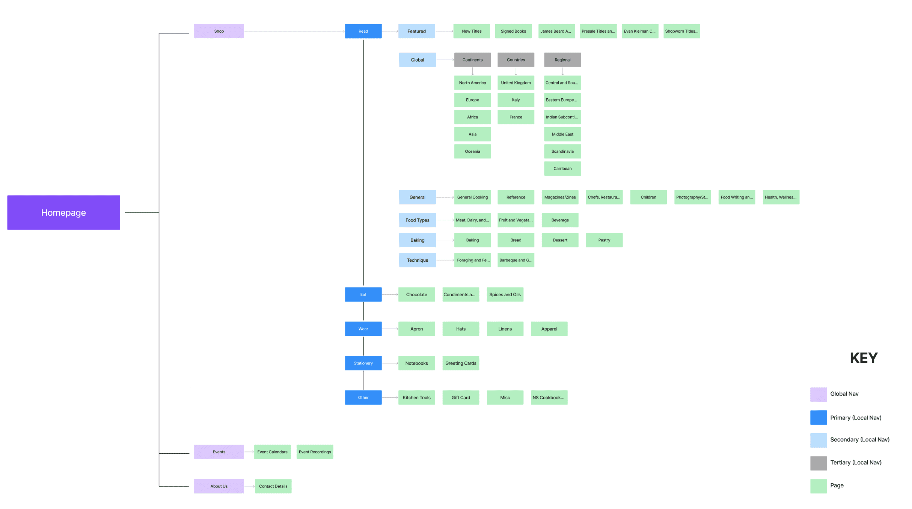
SITE MAP
SITE MAP
Using the categories derived from the card sorting exercise and insights from my research, I created a site map to establish a clear blueprint for the site. This structure was designed to make it easier for users to navigate and find cookbooks of interest intuitively, while also encouraging them to discover new titles seamlessly.
Using the categories derived from the card sorting exercise and insights from my research, I created a site map to establish a clear blueprint for the site. This structure was designed to make it easier for users to navigate and find cookbooks of interest intuitively, while also encouraging them to discover new titles seamlessly.
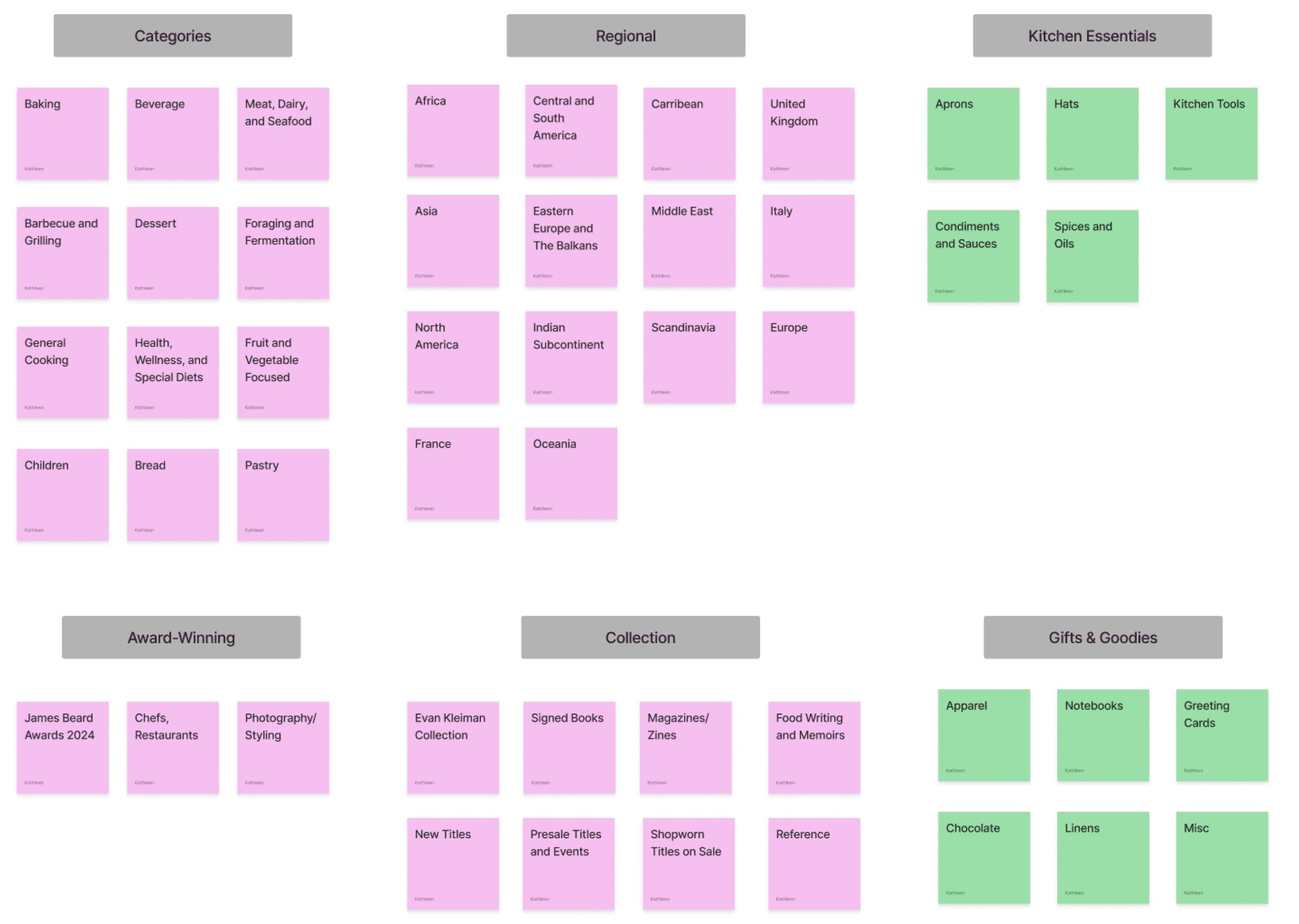
CARD SORTING
CARD SORTING
To address the issue of unclear categorization, particularly within the navigation categories identified during the site evaluation, I gathered all the existing categories and conducted a card sorting exercise. This approach allowed me to understand how users naturally group and organize information, providing valuable insights to create a more intuitive and simplified navigation system.
To address the issue of unclear categorization, particularly within the navigation categories identified during the site evaluation, I gathered all the existing categories and conducted a card sorting exercise. This approach allowed me to understand how users naturally group and organize information, providing valuable insights to create a more intuitive and simplified navigation system.
USER FLOW
USER FLOW
Task: Checking out a French Pastry Cookbook on Now Serving.
Task: Checking out a French Pastry Cookbook on Now Serving.

SKETCHES
SKETCHES
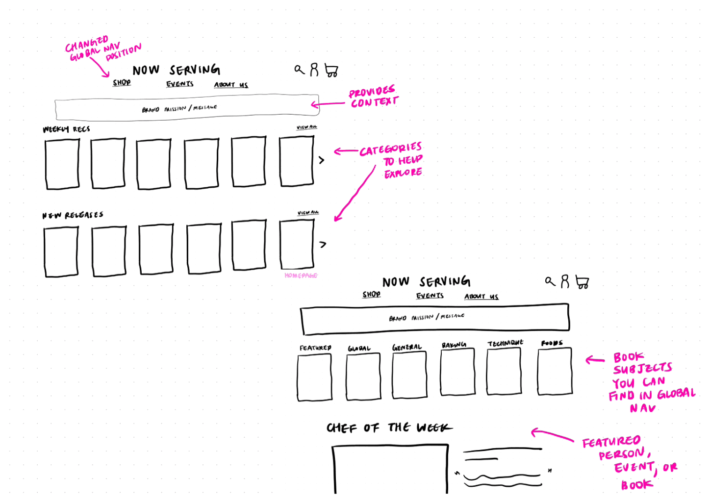
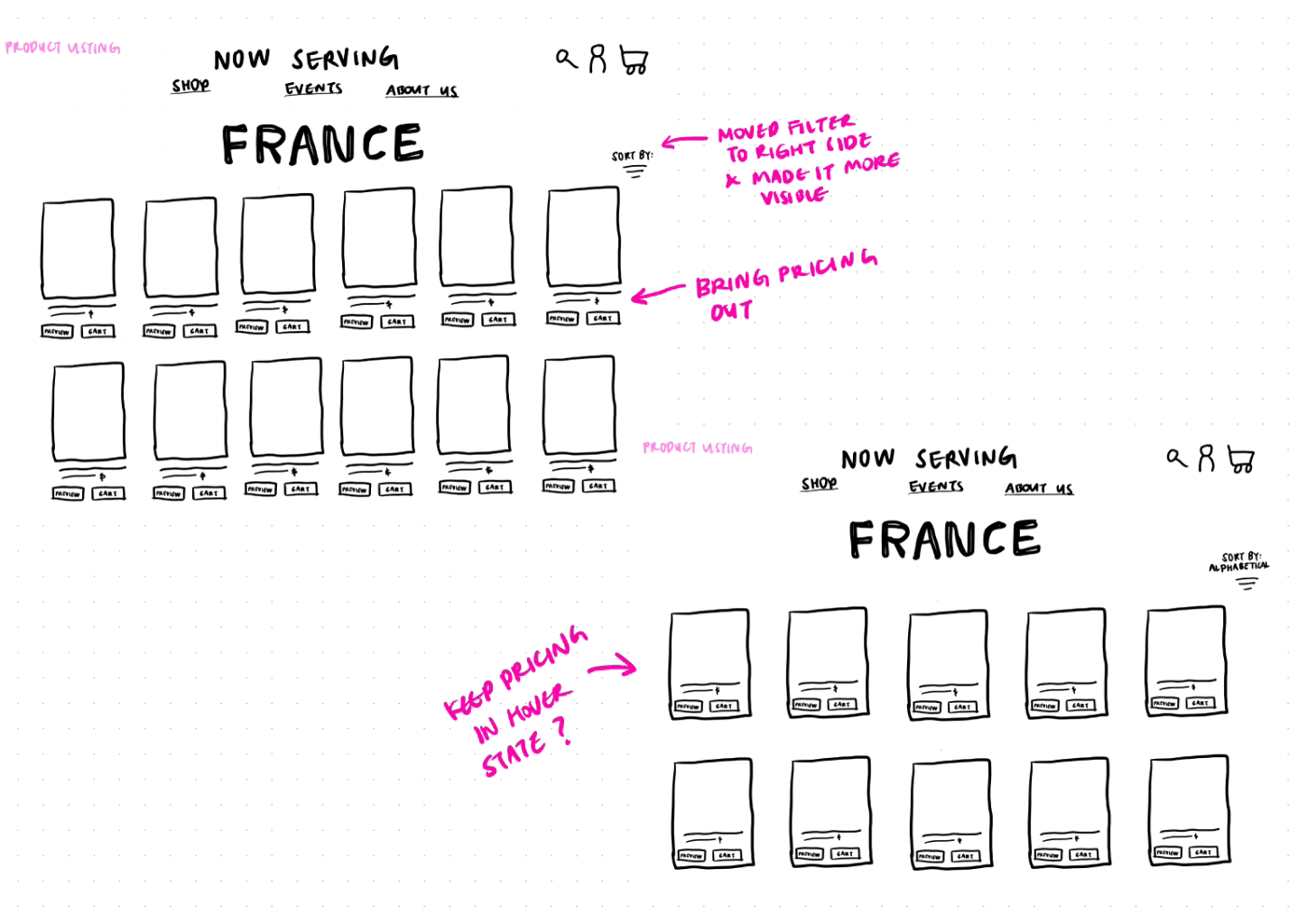
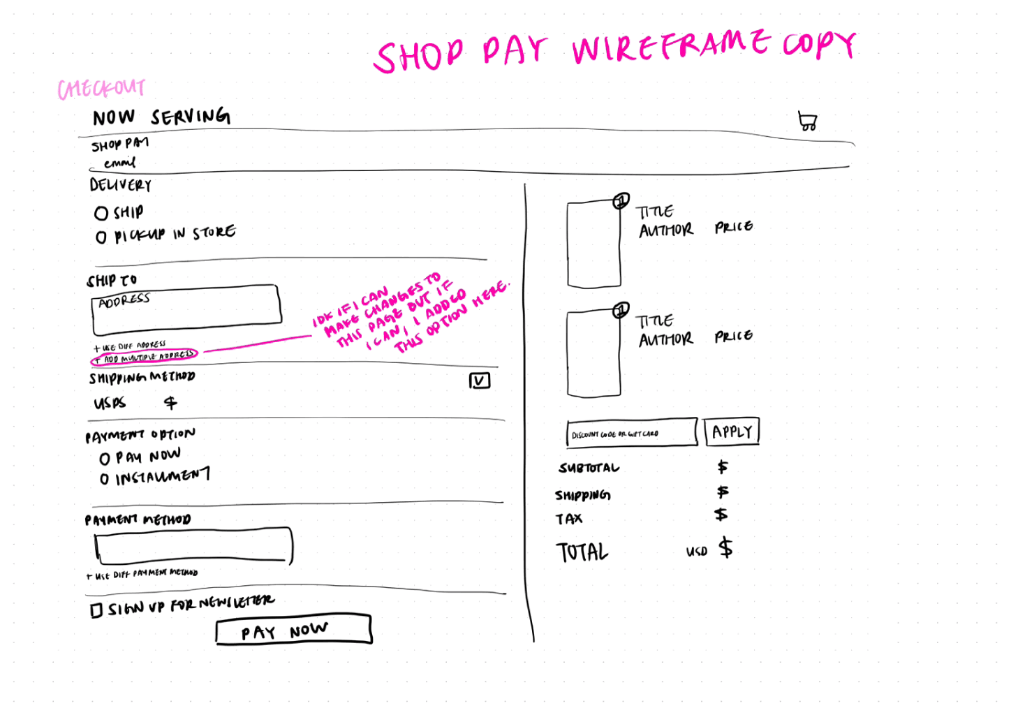
Here are the sketches I made based on the user flow above.
Here are the sketches I made based on the user flow above.
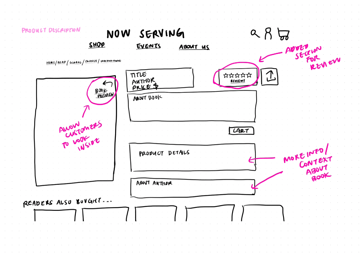
PRODUCT DESCRIPTION
PRODUCT DESCRIPTION
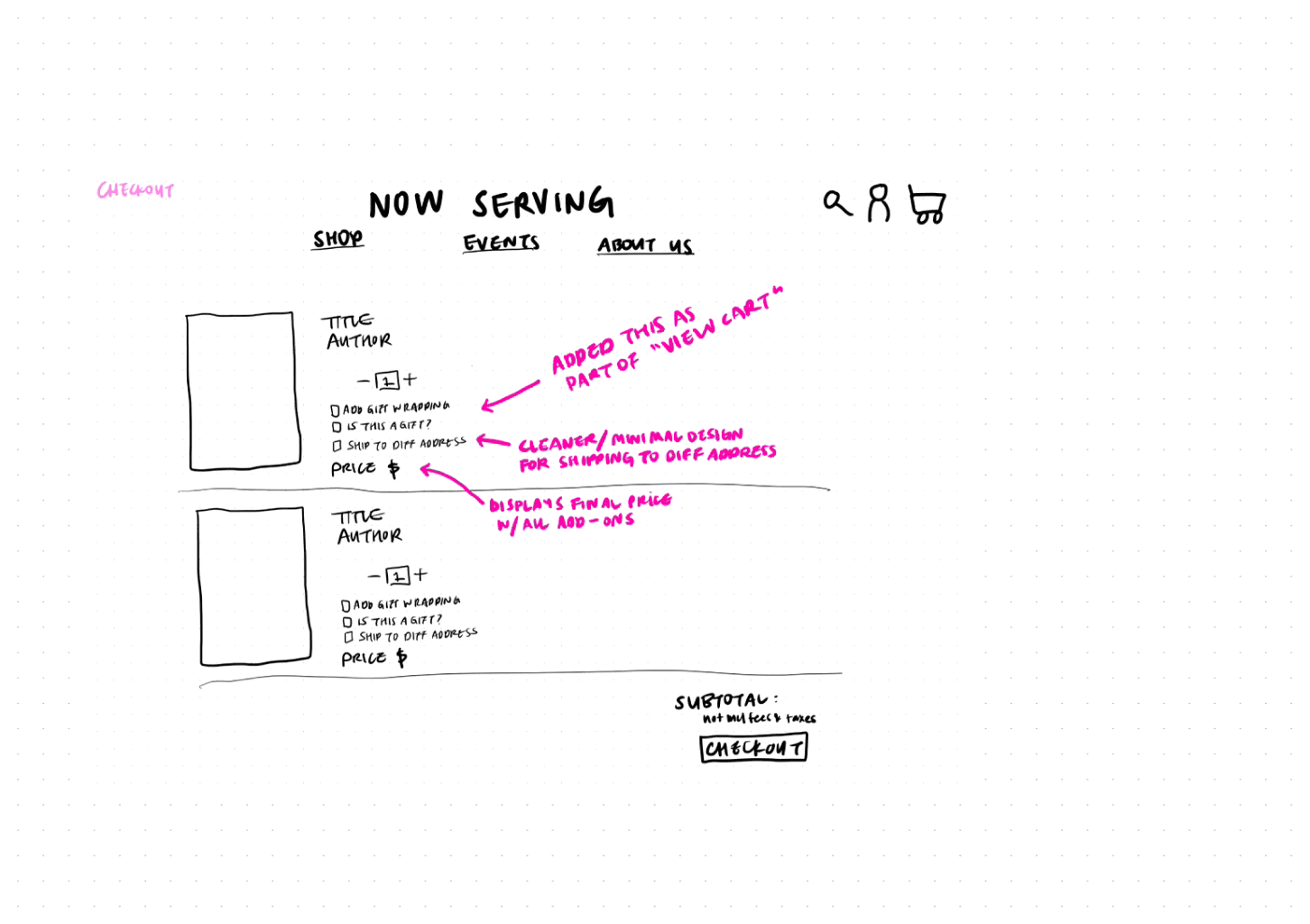
VIEW CART
VIEW CART
HOME PAGE
HOME PAGE
PRODUCT LISTING
PRODUCT LISTING
CHECKOUT
CHECKOUT
TESTING

USABILITY TEST PLAN
USABILITY TEST PLAN
To validate the design, I conducted usability testing, gathering feedback that informed further refinements. Test participants interacted with the prototype, focusing on ease of navigation and the clarity of product information. I had the participants follow the user flow task which was the check out a French pastry cookbook.
To validate the design, I conducted usability testing, gathering feedback that informed further refinements. Test participants interacted with the prototype, focusing on ease of navigation and the clarity of product information. I had the participants follow the user flow task which was the check out a French pastry cookbook.
RESULTS
RESULTS
Based on the result of this test, here were some of the findings. I used these findings and implemented them into the final design. Because this was a 3 week sprint, I decided to focus on finalizing the home page, product listing page, and product detail page.
Based on the result of this test, here were some of the findings. I used these findings and implemented them into the final design. Because this was a 3 week sprint, I decided to focus on finalizing the home page, product listing page, and product detail page.


VISUAL DESIGN
MOODBOARD
MOODBOARD
To guide the visual design, I created a mood board inspired by the following keywords: wood counter/bookshelf, open kitchen concept, people coming together, food as a universal language, and building community through shared meals. These ideas informed the design's aesthetic, emphasizing simplicity, openness, and a natural feel that evokes warmth and connection.
To guide the visual design, I created a mood board inspired by the following keywords: wood counter/bookshelf, open kitchen concept, people coming together, food as a universal language, and building community through shared meals. These ideas informed the design's aesthetic, emphasizing simplicity, openness, and a natural feel that evokes warmth and connection.
I used a muted mauve color palette to align with the brand’s original color scheme while reinforcing a sense of calm and unity. This approach ensured the design stayed true to the brand’s identity while enhancing its appeal and usability for a diverse audience.
I used a muted mauve color palette to align with the brand’s original color scheme while reinforcing a sense of calm and unity. This approach ensured the design stayed true to the brand’s identity while enhancing its appeal and usability for a diverse audience.


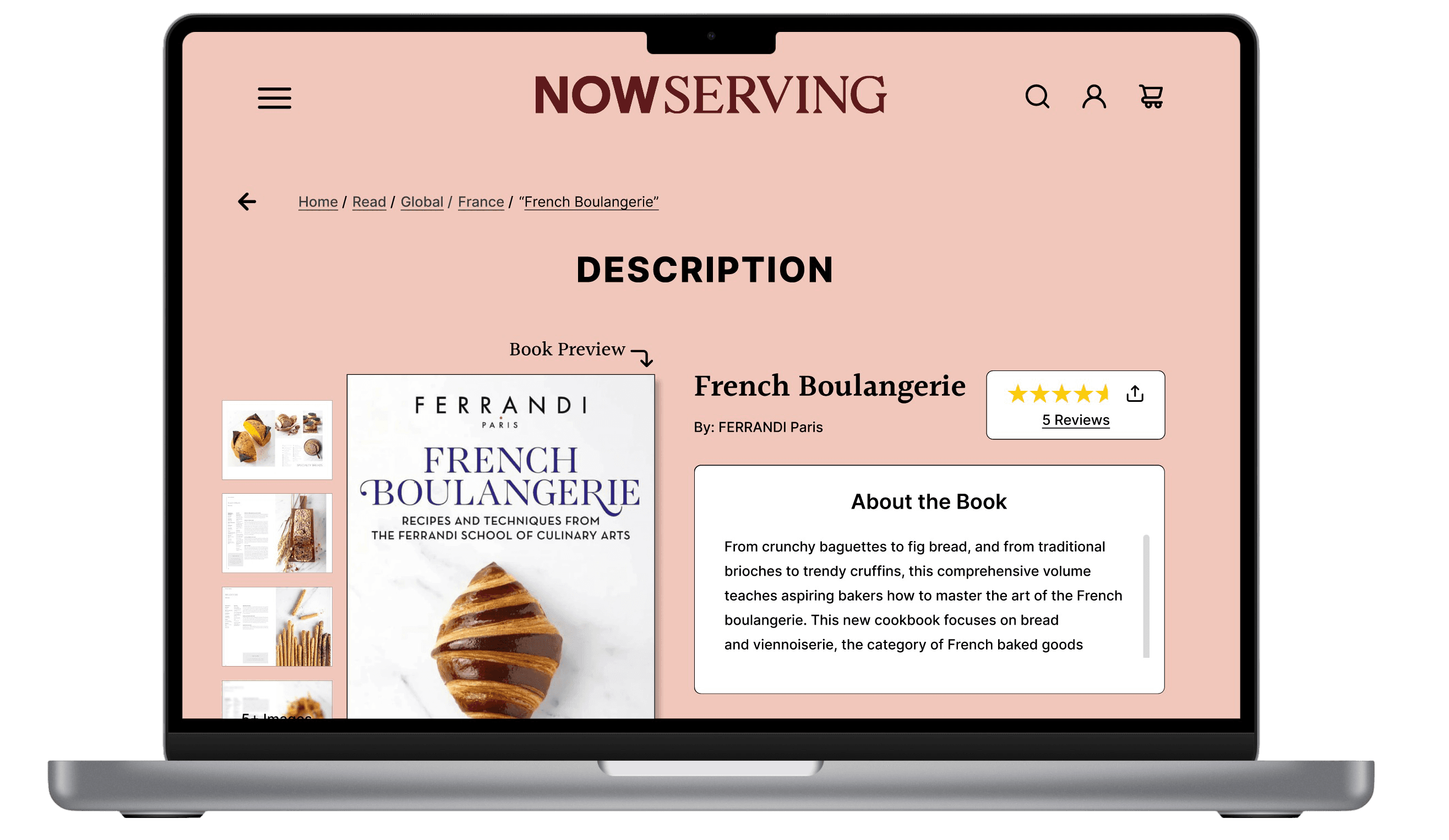
FINAL DESIGN
FINAL DESIGN
This is the final design for the product description page. I also redesigned the product listing and homepage design as well, ensuring a cohesive and user-friendly experience across the site. You can explore the final prototype by clicking the link below.
This is the final design for the product description page. I also redesigned the product listing and homepage design as well, ensuring a cohesive and user-friendly experience across the site. You can explore the final prototype by clicking the link below.

OUTCOMES
GOALS ACHIEVED
GOALS ACHIEVED
The final design successfully addressed the core issues of the original site, providing users with an enhanced cookbook discovery experience through comprehensive product information and an improved navigation system. The redesigned site now offers users enough information to make confident purchasing decisions, with detailed product pages and easy navigation.
The final design successfully addressed the core issues of the original site, providing users with an enhanced cookbook discovery experience through comprehensive product information and an improved navigation system. The redesigned site now offers users enough information to make confident purchasing decisions, with detailed product pages and easy navigation.
KEY TAKEAWAYS
KEY TAKEAWAYS
Visual Content Builds Trust: High-quality photos (covers, sample pages) help users evaluate a product and feel confident about their purchase.
Visual Content Builds Trust: High-quality photos (covers, sample pages) help users evaluate a product and feel confident about their purchase.
Clear Organization Improves Navigation: Categorizing by cuisine, themes, and cooking styles helps users explore and discover cookbooks easily.
Clear Organization Improves Navigation: Categorizing by cuisine, themes, and cooking styles helps users explore and discover cookbooks easily.
Encouraging Exploration Boosts Interest: Highlighting curated collections or unique cookbooks invites users to discover new favorites.
Encouraging Exploration Boosts Interest: Highlighting curated collections or unique cookbooks invites users to discover new favorites.
FUTURE IMPROVEMENTS
FUTURE IMPROVEMENTS
Although I focused on enhancing the product pages, which significantly contribute to improving the user experience on the site, there are still additional features I can implement to further elevate the website and improve cookbook discovery. Some ideas to enhance the experience include:
Although I focused on enhancing the product pages, which significantly contribute to improving the user experience on the site, there are still additional features I can implement to further elevate the website and improve cookbook discovery. Some ideas to enhance the experience include:

Enhanced Product Pages
Enhanced Product Pages
Add interactive previews of cookbooks, such as flip-through features or video previews of sample pages.
Integrate recipe excerpts or 'look inside' options to give users a deeper sense of the book's content.
Include user-generated content like photos or testimonials from customers who tried the recipes.

Personalization Features
Personalization Features
Offer custom recommendations based on user preferences, browsing behavior, or past purchases.
Create wishlists or save-for-later features for books users might want to revisit.
Add a 'You May Also Like' section to encourage exploration and cross-selling."
Offer custom recommendations based on user preferences, browsing behavior, or past purchases.
Create wishlists or save-for-later features for books users might want to revisit.
Add a 'You May Also Like' section to encourage exploration and cross-selling."
© Kathleen Cho 2025


© Kathleen Cho 2025