
Shazam: Music Discovery App
Shazam: Music Discovery App

TIMELINE
TIMELINE
TIMELINE
TIMELINE
3 Week Sprint
3 Week Sprint
3 Week Sprint
3 Week Sprint
TEAM
TEAM
TEAM
TEAM
3 People
3 People
3 People
3 People
ROLE
ROLE
ROLE
ROLE
UX Research, UX Design, Project Manager
UX Research, UX Design, Project Manager
UX Research, UX Design, Project Manager
UX Research, UX Design, Project Manager
TOOLS
TOOLS
TOOLS
TOOLS
Figma/Figjam, G-Suite, Zoom, Slack, Jira
Figma/Figjam, G-Suite, Zoom, Slack, Jira
Figma/Figjam, G-Suite, Zoom, Slack, Jira
Figma/Figjam, G-Suite, Zoom, Slack, Jira
PROJECT OVERVIEW
PROJECT OVERVIEW
PROJECT OVERVIEW
PROJECT OVERVIEW
Shazam offers powerful tools for music discovery, but for many users, they spend no more than 30 seconds on the app before moving on, its full potential remaining untapped. We embarked on a mission to change that. We wanted to redesign Shazam in away that would captivate users, keep them engaged, and encourage a more deeper exploration of the music that they discover.
Shazam offers powerful tools for music discovery, but for many users, they spend no more than 30 seconds on the app before moving on, its full potential remaining untapped. We embarked on a mission to change that. We wanted to redesign Shazam in away that would captivate users, keep them engaged, and encourage a more deeper exploration of the music that they discover.
TXI is an AI performance marketing company focused on helping businesses improve their ad performance. By using advanced AI technology, TXI optimizes
ad campaigns for companies. TXI faced significant challenges in their ad approval process due to reliance on spreadsheets, leading to data chaos. Users felt overwhelmed, struggled to manage the approval workflow, and had difficulty communicating updates. This disorganization slowed down campaign launches and impacted client satisfaction, highlighting the need for a more streamlined solution.
Shazam offers powerful tools for music discovery, but for many users, they spend no more than 30 seconds on the app before moving on, its full potential remaining untapped. We embarked on a mission to change that. We wanted to redesign Shazam in away that would captivate users, keep them engaged, and encourage a more deeper exploration of the music that they discover.
OBJECTIVE
OBJECTIVE
OBJECTIVE
OBJECTIVE
The objective of the TXI project was to streamline their ad approval process by replacing inefficient spreadsheets with a centralized platform that improved usability, maintained brand consistency, and enhanced collaboration.
The objective of the Shazam redesign project was to improve the overall user experience by enhancing the app’s information architecture, making key features more visible and accessible, and streamlining the music discovery process. By reducing friction and clarifying navigation, the redesign aimed to keep users engaged for longer periods, encouraging deeper exploration within the app while maintaining its core functionality and brand identity.
The objective of the TXI project was to streamline their ad approval process by replacing inefficient spreadsheets with a centralized platform that improved usability, maintained brand consistency, and enhanced collaboration.
The objective of the TXI project was to streamline their ad approval process by replacing inefficient spreadsheets with a centralized platform that improved usability, maintained brand consistency, and enhanced collaboration.
OUTCOME
OUTCOME
OUTCOME
The project successfully transformed Shazam into a more engaging platform for music discovery. Key updates, like introducing a home screen map, improving feature visibility, simplifying navigation, and improving content organization, encouraged users to explore beyond music recognition. These changes increased session times beyond the 30-second average, enhanced music discovery, and boosted user satisfaction by providing a more curated and enjoyable experience.
The newly designed TXI ad approval platform has streamlined workflows and increased user control, leading to faster decision-making and improved collaboration. Users now feel more confident and supported, enhancing their overall experience. By integrating user feedback, the platform is not only responsive to current needs but also adaptable for future enhancements.
The project successfully transformed Shazam into a more engaging platform for music discovery. Key updates, like introducing a home screen map, improving feature visibility, simplifying navigation, and improving content organization, encouraged users to explore beyond music recognition. These changes increased session times beyond the 30-second average, enhanced music discovery, and boosted user satisfaction by providing a more curated and enjoyable experience.
MY ROLE
MY ROLE
For this project, I served as the UX Researcher and Project Manager, taking on a range of responsibilities. I conducted three user interviews and three usability tests to gather insights and validate designs. I created the user persona "Harmony" to represent our target audience and sketched the initial design concepts. Additionally, I proposed incorporating descriptive and themed tags for songs to enhance discoverability and user engagement.
For this project, I served as the UX Researcher and Project Manager, taking on a range of responsibilities. I conducted three user interviews and three usability tests to gather insights and validate designs. I created the user persona "Harmony" to represent our target audience and sketched the initial design concepts. Additionally, I proposed incorporating descriptive and themed tags for songs to enhance discoverability and user engagement.

RESEARCH
RESEARCH
RESEARCH OBJECTIVE
RESEARCH OBJECTIVE
RESEARCH OBJECTIVE
RESEARCH OBJECTIVE
We wanted to explore how users discovered new songs, what their motivations for finding new music were, how they collected their music, and how they liked to share it with others.
We wanted to explore how users discovered new songs, what their motivations for finding new music were, how they collected their music, and how they liked to share it with others.
We wanted to explore how users discovered new songs, what their motivations for finding new music were, how they collected their music, and how they liked to share it with others.
What We Discovered
What We Discovered
What We Discovered

We interviewed 5 people on their relationship to music and had four main findings
We interviewed 5 people on their relationship to music and had four main findings
Music helps users bond with others.
Music helps users bond with others.
Music is a user’s companion that follows them throughout the day
Music is a user’s companion that follows them throughout the day
Music enhances a mood.
Music enhances a mood.
Music gives users more knowledge about culture, trends, and the past.
Music gives users more knowledge about culture, trends, and the past.
USER PERSONAS
USER PERSONAS
USER PERSONAS
Based on our user research, 2 user personas were born.
Based on our user research, 2 user personas were born.
Based on our user research, 2 user personas were born.

Harmony is “The Curator”. She is a first-time business owner who is one year into running her cafe and wine bar. By day, it’s a calm, aesthetic cafe filled with regulars and by evening, it transforms into a vibrant, lively wine bar bringing in a variety of people based on events she hosts. As a new entrepreneur, she feels the excitement of creating fun, themed events for her customers to enjoy. However, she is still learning how to curate music that resonates with her customers and suits the events that she hosts.
Harmony is “The Curator”. She is a first-time business owner who is one year into running her cafe and wine bar. By day, it’s a calm, aesthetic cafe filled with regulars and by evening, it transforms into a vibrant, lively wine bar bringing in a variety of people based on events she hosts. As a new entrepreneur, she feels the excitement of creating fun, themed events for her customers to enjoy. However, she is still learning how to curate music that resonates with her customers and suits the events that she hosts.
Harmony is “The Curator”. She is a first-time business owner who is one year into running her cafe and wine bar. By day, it’s a calm, aesthetic cafe filled with regulars and by evening, it transforms into a vibrant, lively wine bar bringing in a variety of people based on events she hosts. As a new entrepreneur, she feels the excitement of creating fun, themed events for her customers to enjoy. However, she is still learning how to curate music that resonates with her customers and suits the events that she hosts.

Shayna is “The Self Exploring College Student”. She is a 21 year old active streamer who is in the process of finding herself and her own unique image and does this through music. She is an introverted extrovert who feels that music is the best way to enhance any experience by adding a deeper layer to the surface as it accompanies her most of the time, both with friends, and when she needs time on her own.
Shayna is “The Self Exploring College Student”. She is a 21 year old active streamer who is in the process of finding herself and her own unique image and does this through music. She is an introverted extrovert who feels that music is the best way to enhance any experience by adding a deeper layer to the surface as it accompanies her most of the time, both with friends, and when she needs time on her own.
Shayna is “The Self Exploring College Student”. She is a 21 year old active streamer who is in the process of finding herself and her own unique image and does this through music. She is an introverted extrovert who feels that music is the best way to enhance any experience by adding a deeper layer to the surface as it accompanies her most of the time, both with friends, and when she needs time on her own.
Choosing The Primary Persona
Choosing The Primary Persona
Choosing The Primary Persona
Both Harmony and Shayna need to discover a variety of music, but we needed to choose a primary persona.
Both Harmony and Shayna need to discover a variety of music, but we needed to choose a primary persona.
Both Harmony and Shayna need to discover a variety of music, but we needed to choose a primary persona.

We chose Harmony because she has a more specific purpose for discovering music.
We chose Harmony because she has a more specific purpose for discovering music.
We chose Harmony because she has a more specific purpose for discovering music.

COMPETITIVE ANALYSIS
COMPETITIVE ANALYSIS
COMPETITIVE ANALYSIS
We realized that Shazam shares many elements of their competitors’ apps such as: artist page, top songs, similar songs, albums, country chart, etc. However, we this analysis did indicate that to us that although Shazam had the same features as many of their competitors already, but due to Information Architecture, users were only exposed to the feature of their home screen, tapping to recognize a song
We realized that Shazam shares many elements of their competitors’ apps such as: artist page, top songs, similar songs, albums, country chart, etc. However, we this analysis did indicate that to us that although Shazam had the same features as many of their competitors already, but due to Information Architecture, users were only exposed to the feature of their home screen, tapping to recognize a song
We realized that Shazam shares many elements of their competitors’ apps such as: artist page, top songs, similar songs, albums, country chart, etc. However, we this analysis did indicate that to us that although Shazam had the same features as many of their competitors already, but due to Information Architecture, users were only exposed to the feature of their home screen, tapping to recognize a song


INFORMATION
ARCHITECTURE
HEURISTICS EVALUATION
HEURISTICS EVALUATION
HEURISTICS EVALUATION
Users like Harmony weren’t aware that they could connect their Shazam to their Spotify.
Users like Harmony weren’t aware that they could connect their Shazam to their Spotify.
Through the heuristics evaluation we noticed that Shazam violated the heuristics of Learnability and Efficiency, Error Management, and Consistency and Standards. This indicated that users like Harmony weren’t aware that they could connect their Shazam to their Spotify, and even if they did, the user would have trouble finding the song on Spotify because it often isn’t the first song they see.
Through the heuristics evaluation we noticed that Shazam violated the heuristics of Learnability and Efficiency, Error Management, and Consistency and Standards. This indicated that users like Harmony weren’t aware that they could connect their Shazam to their Spotify, and even if they did, the user would have trouble finding the song on Spotify because it often isn’t the first song they see.
We also discovered that Shazam’s exploration discovery flow was buried within a different screens, despite it being a key feature of Shazam.
We also discovered that Shazam’s exploration discovery flow was buried within a different screens, despite it being a key feature of Shazam.

How Might We Fix The Problem?
How Might We Fix The Problem?
How Might We Fix The Problem?

The Dilemma
The Dilemma
The Dilemma

CARD SORTING
CARD SORTING
CARD SORTING
We found out key features like the Global Music Discovery should be more easily accessible.
We found out key features like the Global Music Discovery should be more easily accessible.
We found out key features like the Global Music Discovery should be more easily accessible.
Based on these results, we were able to create a site map to structure the app’s pages to help us visualize and organize information in a way that aligns with the user preferences. This helped the ensure that each page and feature was placed in a way that would follow the flow of how users interact with the the app.
Based on these results, we were able to create a site map to structure the app’s pages to help us visualize and organize information in a way that aligns with the user preferences. This helped the ensure that each page and feature was placed in a way that would follow the flow of how users interact with the the app.
Based on these results, we were able to create a site map to structure the app’s pages to help us visualize and organize information in a way that aligns with the user preferences. This helped the ensure that each page and feature was placed in a way that would follow the flow of how users interact with the the app.

USER FLOW
USER FLOW
USER FLOW
We came up with a user flow:
We came up with a user flow:
We came up with a user flow:
Harmony wants to discover more music that matches her specific theme of an “International Wine Event.”
Harmony wants to discover more music that matches her specific theme of an “International Wine Event.”
Harmony wants to discover more music that matches her specific theme of an “International Wine Event.”


IDEATION
IDEATION
SKETCHING (FIRST ROUND)
SKETCHING (FIRST ROUND)
SKETCHING (FIRST ROUND)
We did a design studio, putting together all the research and ideas we gathered. With these sketches, we conducted a design critique with our colleagues.
We did a design studio, putting together all the research and ideas we gathered. With these sketches, we conducted a design critique with our colleagues.
We did a design studio, putting together all the research and ideas we gathered. With these sketches, we conducted a design critique with our colleagues.

Design Critique Feedback
Design Critique Feedback
Design Critique Feedback
Some Suggestions We Took
Some Suggestions We Took
Some Suggestions We Took

Some Suggestions Gave Us Factors to Consider
Some Suggestions Gave Us Factors to Consider
Some Suggestions Gave Us Factors to Consider

We Conducted An Experiment
We Conducted An Experiment
We Conducted An Experiment
As part of our experiment, we visited various music streaming sites and clicked on unfamiliar songs, attempting to understand them without sound. During this process, we discovered that clues like instrumentals, genre information, song adjectives, and even tools like a sound frequency bar were surprisingly helpful in giving us a rough sense of what the song might sound like.
As part of our experiment, we visited various music streaming sites and clicked on unfamiliar songs, attempting to understand them without sound. During this process, we discovered that clues like instrumentals, genre information, song adjectives, and even tools like a sound frequency bar were surprisingly helpful in giving us a rough sense of what the song might sound like.
As part of our experiment, we visited various music streaming sites and clicked on unfamiliar songs, attempting to understand them without sound. During this process, we discovered that clues like instrumentals, genre information, song adjectives, and even tools like a sound frequency bar were surprisingly helpful in giving us a rough sense of what the song might sound like.

We Found The Solution
We Found The Solution
We Found The Solution
Based on this insight, we decided to include genre tags and descriptive adjectives to help users quickly identify a song's vibe and determine if it fits a playlist theme. To further enhance this experience, we also incorporated visuals and sound frequency bars for additional context. Now we were ready for our final sketches.
Based on this insight, we decided to include genre tags and descriptive adjectives to help users quickly identify a song's vibe and determine if it fits a playlist theme. To further enhance this experience, we also incorporated visuals and sound frequency bars for additional context. Now we were ready for our final sketches.
Based on this insight, we decided to include genre tags and descriptive adjectives to help users quickly identify a song's vibe and determine if it fits a playlist theme. To further enhance this experience, we also incorporated visuals and sound frequency bars for additional context. Now we were ready for our final sketches.
FINAL SKETCHES
FINAL SKETCHES
FINAL SKETCHES


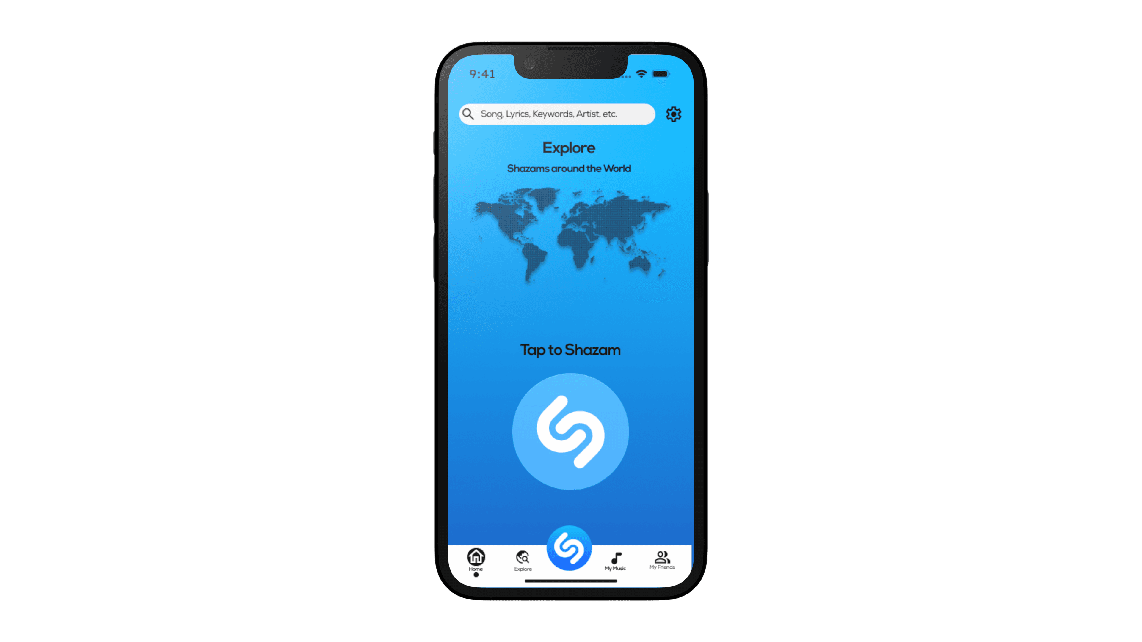
Bottom Navigation Bar: To boost awareness and engagement with Shazam’s music exploration tools, we introduced a map on the home screen. This design change encourages users who open the app for music recognition to explore more features, addressing the issue of users quickly leaving after recognizing a song.
Bottom Navigation Bar: To boost awareness and engagement with Shazam’s music exploration tools, we introduced a map on the home screen. This design change encourages users who open the app for music recognition to explore more features, addressing the issue of users quickly leaving after recognizing a song.
Clearer UX Copy: We renamed “Taste Breakers” to "Adventurous Shazams" and added a brief description to encourage users to explore experimental sounds outside their usual preferences. This change helps users discover new music, and we believed Harmony would value this feature as she often needs to find diverse music, even if it’s not aligned with her personal taste.
Clearer UX Copy: We renamed “Taste Breakers” to "Adventurous Shazams" and added a brief description to encourage users to explore experimental sounds outside their usual preferences. This change helps users discover new music, and we believed Harmony would value this feature as she often needs to find diverse music, even if it’s not aligned with her personal taste.
Separate Regional Page: We received feedback that the information felt cramped and there were too many options to choose from. In response, we decided to create a separate page to provide a clearer and more manageable experience.
Separate Regional Page: We received feedback that the information felt cramped and there were too many options to choose from. In response, we decided to create a separate page to provide a clearer and more manageable experience.
Information Architecture: To create a more intuitive flow and resolve the issue of scattered information and misplaced key details, we reorganized and prioritized the content, making it easier to explore and navigate.
Information Architecture: To create a more intuitive flow and resolve the issue of scattered information and misplaced key details, we reorganized and prioritized the content, making it easier to explore and navigate.

TESTING
USABILITY TESTING
USABILITY TESTING
Decision For Change: Low-Fi to Mid-Fi
Decision For Change: Low-Fi to Mid-Fi
Decision For Change: Low-Fi to Mid-Fi
Based on the feedback, we began with low-fidelity wireframes and then scaled up to mid-fidelity designs, incorporating images and features for better context. This approach aimed to help users understand the music and its origin, ensuring they could confidently add songs to themed playlists, such as a French Wine Night.
Based on the feedback, we began with low-fidelity wireframes and then scaled up to mid-fidelity designs, incorporating images and features for better context. This approach aimed to help users understand the music and its origin, ensuring they could confidently add songs to themed playlists, such as a French Wine Night.
Based on the feedback, we began with low-fidelity wireframes and then scaled up to mid-fidelity designs, incorporating images and features for better context. This approach aimed to help users understand the music and its origin, ensuring they could confidently add songs to themed playlists, such as a French Wine Night.
Results: What Didn’t Work
Results: What Didn’t Work
Results: What Didn’t Work

Map Interaction: Many thought the would be interactive. Since this impacted user satisfaction, we adjusted the functionality to be clickable
Map Interaction: Many thought the would be interactive. Since this impacted user satisfaction, we adjusted the functionality to be clickable
UX Copy: Many users were confused by the wording and had a difficult time understanding the intentions behind some of the music categories. To address this, we decided to implement a clear, descriptive UX copy that accurately conveys what users can expect from each category.
UX Copy: Many users were confused by the wording and had a difficult time understanding the intentions behind some of the music categories. To address this, we decided to implement a clear, descriptive UX copy that accurately conveys what users can expect from each category.
Filtering Options: Many assumed these options would allow them to further filter down the song choices. To address this, we removed “Feeling Adventurous” and “Based Off Your Taste” and instead added a drop-down menu for users to filter songs by "Genre."
Filtering Options: Many assumed these options would allow them to further filter down the song choices. To address this, we removed “Feeling Adventurous” and “Based Off Your Taste” and instead added a drop-down menu for users to filter songs by "Genre."
Results: What Did Work
Results: What Did Work

Similar Features
Similar Features
Many people said it shared similar features to other music apps like Spotify so it was relatively easy to understand and use.
Many people said it shared similar features to other music apps like Spotify so it was relatively easy to understand and use.

Similar Song Recommendations
Similar Song Recommendations
This made it easier for them to discover new music that matched the without needing to search further.
This made it easier for them to discover new music that matched the without needing to search further.

Simplicity of Home Screen
Simplicity of Home Screen
Even with the map added to the home page, users found it didn’t interfere with music recognition. They appreciated it for revealing a new aspect of Shazam and felt it might encourage further exploration.
Even with the map added to the home page, users found it didn’t interfere with music recognition. They appreciated it for revealing a new aspect of Shazam and felt it might encourage further exploration.
VISUAL DESIGN
VISUAL DESIGN
SHAZAM STYLE GUIDE
SHAZAM STYLE GUIDE
SHAZAM STYLE GUIDE


We looked to Shazam's Official Style Guide for inspiration:
We looked to Shazam's Official Style Guide for inspiration:
We looked to Shazam's Official Style Guide for inspiration:
Shazam's brand identity—minimalistic, clear, with waves, open skies, and the iconic Nexa font—is already well-established. We chose to keep our design closely aligned with this identity.
Shazam's brand identity—minimalistic, clear, with waves, open skies, and the iconic Nexa font—is already well-established. We chose to keep our design closely aligned with this identity.
Shazam's brand identity—minimalistic, clear, with waves, open skies, and the iconic Nexa font—is already well-established. We chose to keep our design closely aligned with this identity.
We did not forget to include WCAG’s contrast AAA guidelines:
We did not forget to include WCAG’s contrast AAA guidelines:
We did not forget to include WCAG’s contrast AAA guidelines:
We ensured all content was legible on each screen by adhering to WCAG’s AAA contrast guidelines and increasing CTA button width to meet A11y standards. We also adjusted spacing and button size to improve accessibility for users as well.
We ensured all content was legible on each screen by adhering to WCAG’s AAA contrast guidelines and increasing CTA button width to meet A11y standards. We also adjusted spacing and button size to improve accessibility for users as well.
We ensured all content was legible on each screen by adhering to WCAG’s AAA contrast guidelines and increasing CTA button width to meet A11y standards. We also adjusted spacing and button size to improve accessibility for users as well.

TAKEAWAYS
TAKEAWAYS
NEXT STEPS
NEXT STEPS
NEXT STEPS
Though the redesign of this app didn’t launch these were the expected outcomes of our finalized project:
Though the redesign of this app didn’t launch these were the expected outcomes of our finalized project:
New features encouraged users to explore more of the app’s offerings.
New features encouraged users to explore more of the app’s offerings.
Curated experiences helped users discover new music tailored to their tastes.
Curated experiences helped users discover new music tailored to their tastes.
Engagement time increased, extending typical usage beyond 30 seconds to over a minute.
Engagement time increased, extending typical usage beyond 30 seconds to over a minute.
Enhanced exploration fostered user satisfaction and loyalty, driving continued app use.
Enhanced exploration fostered user satisfaction and loyalty, driving continued app use.
NEXT STEPS
NEXT STEPS
NEXT STEPS
Expand on “My Friends”
Expand on “My Friends”
Due to our two-week timeline, we didn't prioritize this feature in our primary user flow but included it for users like Shayna. We plan to expand on this feature in the future to boost user engagement.
Due to our two-week timeline, we didn't prioritize this feature in our primary user flow but included it for users like Shayna. We plan to expand on this feature in the future to boost user engagement.

Continue to test UX Copy
Continue to test UX Copy
To evaluate language interpretation, we found that the initial UX copy titles were unclear and needed more detail. We will continue to test their clarity and effectiveness.
To evaluate language interpretation, we found that the initial UX copy titles were unclear and needed more detail. We will continue to test their clarity and effectiveness.
Develop “Explore Mood”
Develop “Explore Mood”
To quickly help Harmony assess music, we created an adjective category. We plan to add an 'Explore Mood' page to leverage this feature further, enhancing user experience and engagement.
To quickly help Harmony assess music, we created an adjective category. We plan to add an 'Explore Mood' page to leverage this feature further, enhancing user experience and engagement.
© Kathleen Cho 2025


© Kathleen Cho 2025